
Project Overview
This case study focuses on designing a tutoring website aimed at students from middle school to university levels as well as adult learners. The goal is creating an intuitive, engaging, and effective platform for connecting students with qualified tutors.
Project Duration
Jun 2023 - Oct 2023 ( 6 Weeks)
My Role
UX UI Designer
Tools
Project Goals
Provide an easy-to-use platform for booking tutoring sessions, facilitate tutor-student communication, ensure a seamless learning experience, and support diverse learning needs.

Design Process
Double Diamond Design process has been used for this project.

Discover
Phase #1
Phase #1
Phase #1
Interview
During the interview phase of our research, I met with 30 students and parents, questioning them about their prior experiences with similar platforms, as well as their challenges and needs.
" I want to be able to check tutors' reviews"
"I am looking for a tutoring platform with an easy booking and searching process"
"It is Important for me to find detail information about tutors' education and experience in their profiles"
Affinity Diagram

Comparative Analysis
We compared the features offered by exciting tutoring platforms. We identified their strengths and weaknesses and areas for improvements.

Survey
We have recruited more than 200 respondents from Fiverr to complete our survey. Then we analyzed this data to identify common issues and user preferences.

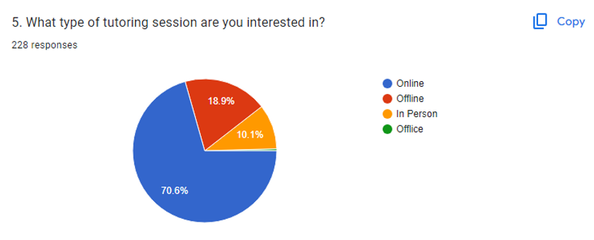
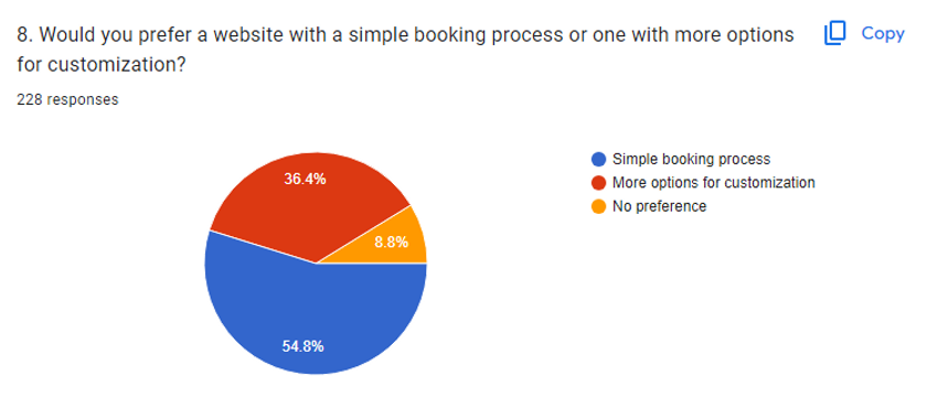


Take away
The insights gathered from the research helped us with several key design decisions, including:
-
Simple scheduling process
-
Detailed information about tutors' qualification and their reviews in the profiles
-
Easy search and filter options
Define
Phase #2
Phase #2
Phase #2
User Persona

User Story
As a mother, I want to easily find a qualified online math tutor, view her availability and book a session at a convenient time, so that I can schedule tutoring without hassle for my daughter.
Task Flow
Task Flow of a user who wants to book & schedule with a private online tutor.
.png)
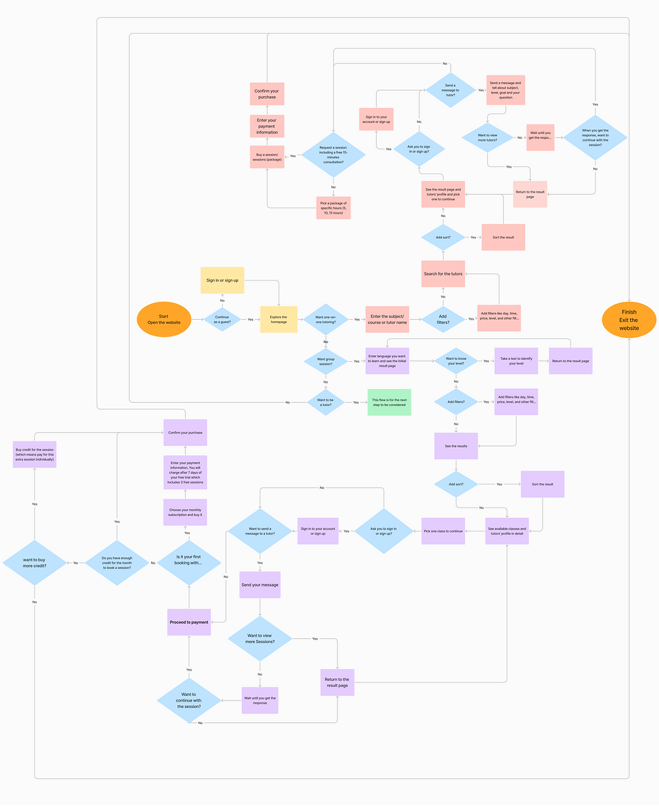
User Flow
User Flow of a user who wants to book & schedule with a private online tutor & Group ESOL Lesson.
Design
Phase #3
Phase #3
Phase #3
Style Guide


Typography
Roboto Font

Grid System


Padding

Radius

Spacing

Develop
Phase #3
Phase #3
Phase #3
Wireframing & Prototyping
Low-Fidelity
We created low-fidelity wireframes to establish the basic layout and structure of each page.
.jpg)

.jpg)

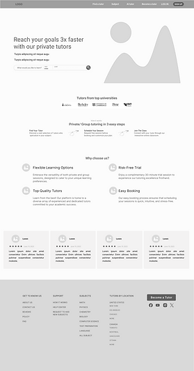
Mid-Fidelity Wireframe


High-Fidelity Prototype
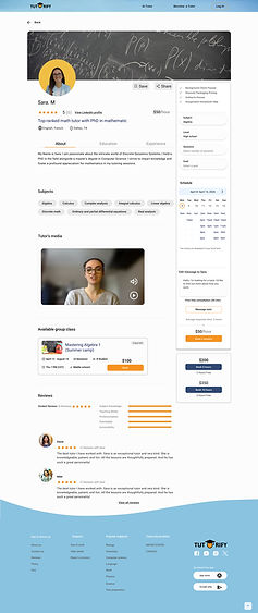
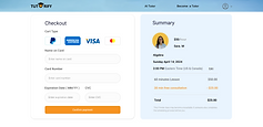
We build Intractive prototypes to simulate the user experience and functionality.



.png)

Usability Testing
We conduct usability testing sessions to observe how user interact with the platform. We had many iterations based on user's feedback and testing results.
Problem: Because of having so much information. It is difficult for user to find necessary information such as experience, teaching subjects.
.png)
Soultion: We removed review about tutor and sentences about teaching subjects. we added box and background color for tutor's experience and subjects
.png)
We added "Book a session" button. to make it easy for user who wants to book a session without opening user profile
Problem: We have found that having dropdown menu for subjects on the navigation bar is not user friendly. Due to verity of subjects, making it frustrating for users to find what they are looking for.
In the search box, lacks the option to select between Privet/Group sessions before searching. User can only filter by Online/In person session.
.png)
Soultion: We enhanced the search box functionality by adding the option to select between privet or group sessions before searching.
We removed the "subjects" and "Find a Tutor" from navigating bar.
.png)
We observed that most users are searching for some popular subjects. To enhance the user experience, we decided to have a section for popular subjects in our first page, this allows users to quickly and easily access the information they need, improving overall usability and reducing friction in the user journey.
Since this platform is a peer-to-peer network between students and tutors, to enhance visibility and accessibility for tutors, we decided to consider a section on the homepage for "Become a Tutor's.
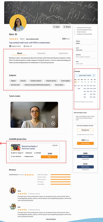
Problem: The calendar, which users use to select their session times, is located between the tutor's information and a video about the tutor. This is confusing for users and makes them feel lost, because all other booking actions are on the right side.
Having collapsible menus for so many information is not visually appealing and user-friendly.

Soultion: To enhance the user experience, we moved the calendar to the right side of the page. We changed the design of the tutors' information to make it visually appealing.
We have created a section for available group classes for tutors who offer both group and individual sessions.
Reflection
-
Effective communication with team members and lead challenging situation.
-
Regularly gather user feedback to identify areas for improvement and use these insights to enhance the website.
-
maintaining a balance between user satisfaction and business objectives.
Experience
Next steps
-
Finalizing the mobile version of platform.
-
Evaluate our current design by doing more user experience testing